Workforce enablement KPIs: 3 layers that show real impact
7 min read

Almost every leader believes enablement pays off. 98% of scale-up leaders are confident that learning and enablement drive measurable business outcomes.
Proving it is harder. Completions are easy to count. So are employee engagement scores and review ratings. None of them, on their own, shows whether your people got better at the job.
In this article, you’ll find the key performance indicators (KPIs) that do. They sit in three layers: the business outcome, the health of each signal, and the connections between them.
How do you know workforce enablement is working?
Workforce enablement is working when it moves a number the business already tracks. That might be time to productivity, retention, or consistency across sites.
You’ll see it in three layers. First, the outcome itself. Second, the health of learning, engagement, and performance. Third, whether a change in one signal leads to action in the others.
Most organizations measure the first two. The proof sits in the third.
Why completion rates can’t carry the load
Completions tell you training ran. They can’t tell you whether anything changed.
Learning and development (L&D) teams typically report completions, hours delivered, and catalog size. Each number can climb while the business slides. That’s the tell. As Confirm CEO Adam Thompson puts it:

“A function whose metrics cannot fail is not really driving anything.”
Adam Thompson, CEO, Confirm
A function like that is insulated from consequence. The same goes for survey response rates or a finished review cycle. Each one proves a process ran, not that anyone got better at the job. Each can rise while employee turnover rises with it.
This distinction is the useful one: completions measure whether training happened, while margin measures whether it mattered. Sales teams already work this way. Their enablement is judged on win rates, quota attainment, and ramp time, so it can visibly fail. Most other functions can’t say the same.
A number that can only go up can’t prove impact. You need KPIs that would show you if enablement wasn’t working.
The 3 layers of workforce enablement KPIs
Each layer answers a different question. Did the business number move? Is each signal healthy? Are the signals driving each other?
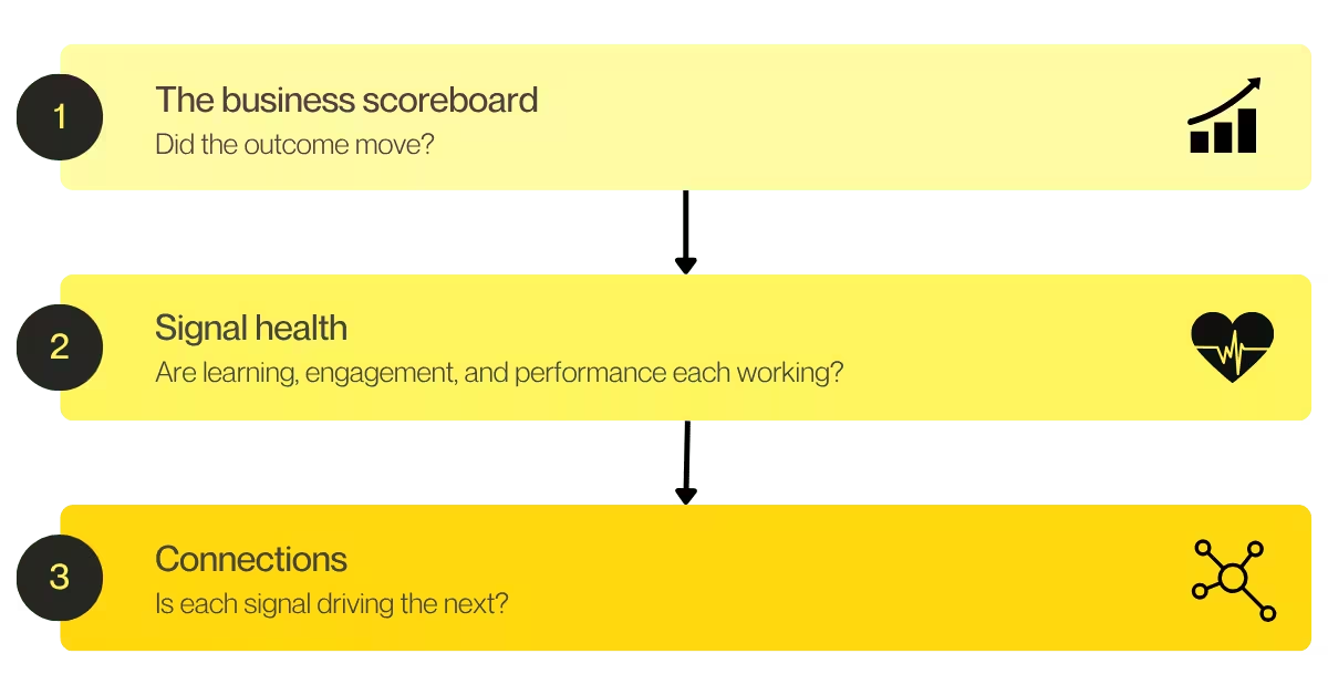
Layer 1: The business scoreboard
Start with the outcome. Enablement should share the team’s own scoreboard, not keep a separate one.
The best KPIs already sit in your business strategy. They’re usually tied to growth, operational efficiency, or risk. Pick one or two the business already reports on:
- Time to full productivity
- Early-tenure retention rates
- Team performance across sites, teams, or pods
- Customer satisfaction or net promoter score (NPS)
- Compliance and audit readiness
For scale-ups, ramp to quota often belongs on this list too.
Measure against your own baseline. Record the number before anything changes. That’s how you’ll show higher productivity or lower turnover later, rather than assume it.
If you can, track a similar team that hasn’t changed yet. That comparison is the simplest honest way to show cause and effect.
Choosing the right outcome is Step 1 of how to build a workforce enablement strategy.
Layer 2: Signal health
These are your leading indicators. They show whether each part of the loop is working before the business number moves.
| Signal | What to track | What it tells you | Watch out for |
|---|---|---|---|
| Learning | Time to find an answer, use in the flow of the work, assessment and practice results | Whether support reaches people when they need it | Reading completions as capability |
| Engagement | Task confidence, sentiment trends, friction reports, early attrition risk | Where people are stuck before performance drops | Survey fatigue, and scores nobody acts on |
| Performance | Goal progress, how often feedback happens, output against standard | Whether capability is showing up in employee performance | Annual-only data that arrives too late |
Engagement KPIs are your window into the employee experience. They often move first, so watch them as close to real time as you can.
Treat a dip as an early warning. Find out what’s behind it before the performance numbers catch up.
Layer 3: Connection KPIs
This is the layer most dashboards miss. It shows whether the talent flywheel is actually turning, with learning, engagement, and performance feeding each other.
Track KPIs like these:
- Time from an engagement dip to a manager acting on it
- Share of performance gaps traced to a cause, such as a skill gap, low confidence, or missing manager support
- Change in confidence after targeted support
- Performance difference between supported teams and your comparison group
- Manager time spent coaching compared with time spent on admin
Each one needs at least two signals to calculate. If you can’t calculate them yet, your signals probably aren’t connected.
That’s a common gap. 39% of frontline leaders say a lack of performance data holds back training and performance. Closing it pays off.
3.5x
Organizations with a totally unified view of workforce performance are over 3.5x as likely to see very consistent performance in peak periods: 53%, compared with 15% for those with only a partial view.

Put your KPIs to the “so what?” and “now what?” test
Run this check on every KPI you track. Two questions expose most weak measures.
- Does it show something happened, but not whether it mattered? That’s a “so what?” problem. A high course completion rate is the classic case. Pair it with a performance KPI, such as output against standard, to see whether capability followed.
- Does it flag a problem, but not the cause? That’s a “now what?” problem. A confidence dip at one site is a good example. Pair it with a learning or engagement KPI, such as assessment results or coaching frequency, to find out whether the gap is skill, support, or morale.
A good scorecard has no KPI standing alone. Every number should connect to at least one other. If a KPI fails both questions and you can’t pair it, drop it.
What a workforce enablement scorecard looks like
Keep it to one page and a handful of KPIs. Here’s how a scorecard might look for each audience.
| Layer | Frontline | Scale-up |
|---|---|---|
| Business scoreboard | Time to full productivity, variation between sites | Ramp to quota, early-tenure retention |
| Signal health | Task confidence by site, use of guidance during shifts, coaching conversations per supervisor | Practice and assessment results, pulse sentiment during onboarding, goal progress |
| Connections | Days from a site’s confidence dip to supervisor action, peak-period performance at supported vs. comparison sites | Confidence change after targeted practice, ramp time for the supported cohort vs. the previous one |
There’s plenty of room to move on both sides. 41% of frontline leaders report extreme or significant variation between their best and worst sites. In scale-ups, new hires take 2.4 months on average to reach full productivity.
Report to leadership with one outcome. Lead with the number they already track, and show the before-and-after against your comparison group. Leave completions off the page.
Where a workforce enablement system (WES) fits
You can build a scorecard by hand for one team. Layer three gets hard fast across many sites or hiring waves.
That’s because the data usually lives apart. There’s a learning platform in one place, an engagement survey in another, and performance reviews somewhere else. Every connection KPI means joining them by hand.
A workforce enablement system (WES) is the technology that makes people capable, ready, and effective at work after they’re hired. It brings learning, engagement, and performance together, supported by content and AI. That lets you equip people, listen for where they’re struggling, act with clear next steps, and measure whether any of it is changing readiness and performance.
With all three signals in one place, connection KPIs come straight out of your reporting. Nobody has to stitch spreadsheets together to get them.
Next steps
Workforce enablement earns its budget when it moves a number the business already tracks. Three layers get you there:
- The business scoreboard shows whether the outcome moved.
- Signal health shows whether learning, engagement, and performance are each working.
- Connection KPIs show whether one signal is driving the next.
Start small. Pick one outcome. Set the baseline. Add one connection KPI. That’s enough to start proving impact.
Ready to see all three layers in one place?

Related resources
- The complete guide to workforce enablement
- Workforce enablement: everything you need to know
- 3 reasons the HRBP won’t survive the next decade
- Exposing the scale-up workforce enablement gap
- The uncomfortable truth about frontline workforce enablement
- The frontline enablement gap report
- The scale-up enablement gap report
- The HRBP won’t survive the next decade whitepaper